High contrast Colors
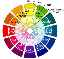
Notice the color wheel: From the mixing of two of the three primary colors (red, yellow, blue), three composite (orange, green, purple). It is known that combining a primary color with complex located opposite of the color wheel, creating a strong contrast. Thus, combinations of red, green, blue and yellow-orange-purple create the most intense color contrasts that can be exploited to make a space more cheerful and lively.
Green-red
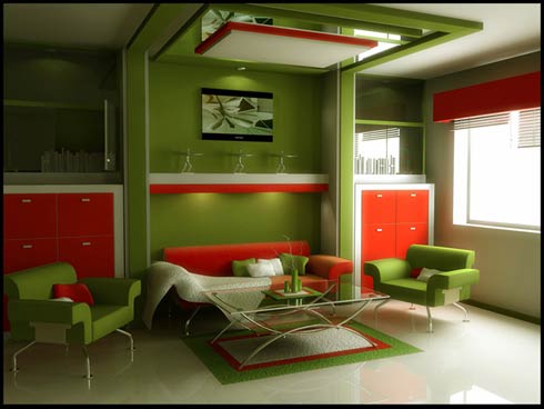
In nature this bold combination is quite often in most explosive forms. Remember the golden images of summer: a sliced watermelon, a meadow with poppies, a loaded cherry fruit! In decorating the lively tones of red and green can be used in homes with modern perception giving them vitality and shine. The darker tones fit in more conventional houses, often creating a sense of weightlessness and warmth. If you want the space to show small and full, use combinations of red-green color as the details (decorative objects and furniture) in a white background.
Yellow-purple
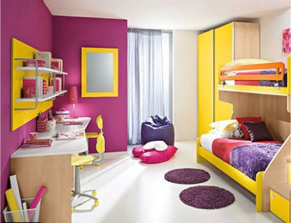
The golden hues of the sun over the purple outline of distant mountains offer a fascinating and often mysterious feeling. The combination of yellow-purple is considered very intensive. It is not used for the main home but can be used in a single room to create a contrast and give a special tone.
Blue – orange
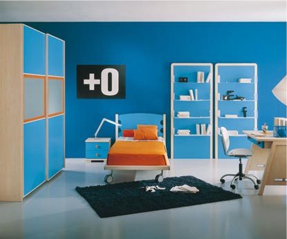
The contrast between the orange and blue and the aesthetic result of the combination each time depend on the selected shades. The dark tones, especially the blues, creating a strong contrast that heats and shrinks the space. This feeling changes when it comes to lighter shades, and especially when add white too. Let’s not forget the example of Mediterranean architecture, which often uses this combination that offers a lighthearted result, fitting homes bathed in sunlight.